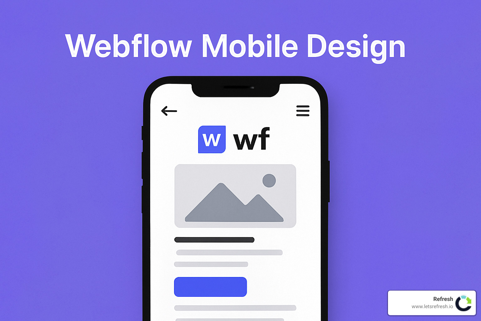
Creating User-Friendly Websites for Small Screens
When I first started designing for mobile devices, I quickly realized how different the experience is from desktop browsing. Webflow mobile design isn't just about shrinking everything down—it's about reimagining how people interact with content on smaller screens.
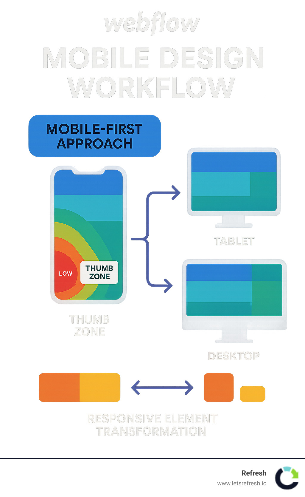
Think about it: your thumb can only reach so far across a phone screen, and that tiny screen has to convey your entire brand message! That's why a mobile-first approach makes so much sense. By designing for the smallest screens first and then expanding to larger ones, you ensure that the core experience works well for everyone.
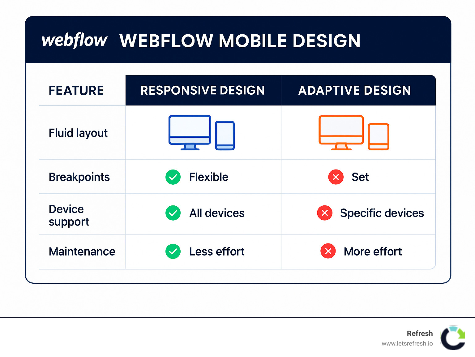
There's often confusion about responsive versus adaptive design. Here's the simple version: responsive design uses fluid grids that automatically adjust to different screen sizes (like water filling different shaped containers), while adaptive design creates fixed layouts for specific screen sizes (more like having different outfits for different occasions). Both approaches have their place in Webflow mobile design, but responsive tends to be more future-proof.
The key elements that make mobile experiences shine include touch-friendly navigation (those hamburger menus aren't just trendy—they're practical!), properly optimized images that don't slow down loading times, simplified content that gets to the point, and text sizing that doesn't require squinting or zooming.
I can't stress enough how important testing is. Browser emulators are convenient, but nothing beats seeing how your site actually performs on real mobile devices. The way a real human thumb interacts with your navigation can reveal usability issues no emulator will catch.
Mobile optimization isn't optional anymore. With over half of all web traffic now coming from mobile devices and a significant 15% of Americans exclusively using smartphones to access the internet, your site's mobile experience directly impacts your revenue and customer satisfaction.
Mobile users have specific behaviors worth understanding:
They typically browse with one thumb, have shorter attention spans than desktop users, often deal with unreliable connections, need larger touch targets (at least 44×44 pixels to avoid frustration), and generally prefer simpler navigation options that don't overwhelm a small screen.
Hi there! I'm Alexander Palmiere, founder of Refresh Digital Strategy. My team and I have helped over 200 businesses implement effective Webflow mobile design solutions that actually drive engagement and conversions. We love creating responsive Webflow sites that not only look beautiful but perform flawlessly whether your customers are on phones, tablets, or desktops.
If you're diving deeper into Webflow mobile design, you might also want to check out our resources on becoming a Webflow Premium Partner or finding the right Webflow development company for your needs.
What you'll learn
Throughout this guide, I'll share the real benefits of embracing mobile-first design in Webflow (spoiler: better conversions is just the start), the common pitfalls I've seen businesses stumble into, and quick wins you can implement today to improve your mobile experience.
Whether you're a small business owner in Pittsburgh looking to improve your existing site's mobile experience, or a Cleveland entrepreneur planning your next web project from scratch, these practical insights will help you create mobile experiences that not only look good but actually convert visitors into customers. Because at the end of the day, that's what matters most to your business.
Why Mobile-First Matters in 2024
The numbers don't lie: mobile is dominating the digital landscape. According to Statista, mobile devices now account for more than half of all web traffic worldwide. In the United States alone, 253.3 million adults will use mobile phones in 2023, with that number continuing to climb.
What's even more eye-opening is that 15% of Americans only access the internet through their smartphones. For these users, your mobile site isn't just an alternative version—it's the only version they'll ever see.
Google has been paying attention to this shift too. Since 2019, they've used mobile-first indexing, meaning they primarily use the mobile version of your site for ranking and indexing. This isn't just some technical footnote—it directly impacts whether people can find you in search results.
Core Web Vitals—Google's way of measuring user experience—also heavily favor sites that load quickly and function smoothly on mobile devices. When your mobile experience shines, Google notices, and so do your visitors.
The business case
Let's talk dollars and sense. Investing in Webflow mobile design isn't just about keeping up with trends—it's about protecting and growing your bottom line.
Reducing mobile site load time by just 0.1 seconds can boost conversions by 8%. Think about that—a tenth of a second difference can measurably impact your sales! And when people find a mobile-friendly site, 74% are more likely to return for another visit.
We've seen this with our clients. A well-designed mobile experience typically shows a 15-20% increase in engagement metrics. People stay longer, click more, and ultimately, convert better.
As one of our clients recently told us, "I didn't realize how many sales we were losing until we fixed our mobile experience." That's the reality for many businesses—invisible losses they don't even know they're suffering.
SEO impact
The search engine benefits of proper Webflow mobile design go far beyond just passing Google's mobile-friendly test.
Since Google primarily looks at your mobile site for ranking signals, a poor mobile experience essentially caps your SEO potential. You can do everything else right, but if your mobile site frustrates users, you're fighting an uphill battle.
Mobile bounce rates directly impact your search rankings too. When someone lands on your site and immediately leaves (which happens frequently with poorly optimized mobile sites), Google interprets this as a sign your content isn't valuable.
According to HubSpot research, 58% of smartphone users prefer companies whose mobile sites remember who they are and their past behavior. This personalization doesn't just make users happy—it signals to search engines that your site provides meaningful value.
Dwell time—how long users stay on your site—is typically shorter on mobile unless you've thoughtfully designed for the small screen experience. Every second counts when someone is browsing on their phone, and a well-designed mobile experience can significantly extend how long they'll engage with your content.
At Refresh, we've helped businesses transform their mobile presence from an afterthought into their primary growth engine. The question isn't whether you can afford to invest in mobile optimization—it's whether you can afford not to.
Responsive, Adaptive, Mobile-First: Choosing Your Approach in Webflow
When diving into Webflow mobile design, you'll encounter three main approaches that can seem a bit overwhelming at first. Don't worry – I'll walk you through each one so you can make the best choice for your website.
Responsive Design
Think of responsive design as your website's ability to gracefully adjust to any screen size – like water taking the shape of whatever container it's in. Using fluid grids, flexible images, and CSS media queries, responsive design creates layouts that automatically adapt to the viewer's device.
What's great about responsive design is that you only need to maintain a single codebase, making updates much simpler. It's also naturally future-proof since it can handle new device sizes without requiring a redesign. Search engines love responsive sites too, giving you an SEO advantage.
The downside? If not properly optimized, responsive sites can load a bit slower since they're sending the same content to all devices. You'll also need to think more carefully about how elements transform across different screens, which can sometimes lead to compromises in the desktop experience.
Adaptive Design
Adaptive design takes a different approach. Instead of fluid adjustments, it creates separate fixed layouts for specific device sizes. When someone visits your site, the server detects their device and delivers the version designed specifically for that screen.
This approach gives you incredible control over the user experience on each device type. Loading times can be faster since layouts are pre-built for specific screens. You can also create highly targeted experiences optimized for exactly how people use different devices.
The catch is that you'll need to maintain multiple versions of your site, which can become a headache. New device sizes might break your design until you create another version. And implementing adaptive design in Webflow requires more technical knowledge than responsive approaches.
Mobile-First Design
Mobile-first flips the traditional design process on its head. Instead of starting with a desktop design and then figuring out how to make it work on smaller screens, you begin with the mobile experience and progressively improve it for larger devices.
This approach forces you to focus on what truly matters – essential content and core features. Your mobile site will typically perform better because you've prioritized speed and simplicity from the start. It also aligns perfectly with Google's mobile-first indexing, potentially boosting your search rankings.
The challenge is that mobile-first can feel restrictive when designing complex interfaces. It demands disciplined content prioritization and can be tricky for feature-rich applications where screen real estate matters.
At Refresh, we typically recommend combining responsive design with a mobile-first approach for our clients in Pittsburgh, Cleveland, and Charlotte. This balanced strategy delivers the best performance, easier maintenance, and consistent user experience across all devices.
Breakpoints 101
Breakpoints are like the magic moments when your design transforms to fit different screen sizes. Webflow comes with default breakpoints that make this process much easier:
Webflow gives you these breakpoints out of the box: Desktop (992px and above), Tablet (768px to 991px), Mobile landscape (480px to 767px), and Mobile portrait (479px and below). For special projects, you can also create custom breakpoints – say, if you're designing for extra-large monitors at 1440px or 1920px.
One of the coolest things about Webflow's breakpoint system is the cascade logic. Styles you apply at larger breakpoints automatically flow down to smaller ones unless you specifically override them. This means you can set up your desktop design first, then just tweak what needs changing for smaller screens – saving tons of time.
When a separate mobile version makes sense
While we generally favor responsive approaches at Refresh, there are times when a separate mobile version might actually be the better choice.
If your mobile users need completely different content than desktop users, a separate version might make sense. The same goes for situations where extreme performance is critical – like an e-commerce site where even a slight delay could cost you sales. Complex interactive elements that simply won't translate well to touch interfaces might also warrant a separate approach.
Just be aware of the trade-offs. As one wise Webflow user noted in the forums: "Responsive design is now more popular and better for search engines than separate mobile sites." Maintaining two versions means double the work, and if not done carefully, can actually hurt your page-load times and search rankings.
Whichever approach you choose, the goal remains the same: creating a seamless experience for your users regardless of how they access your site. For more detailed strategies, check out this guide on Mobile-First Design Strategy from our team.
Webflow Mobile Design Best Practices
When we create mobile experiences in Webflow, we're not just shrinking a desktop site – we're crafting an entirely new way for people to connect with your brand. After helping hundreds of businesses across Pittsburgh, Cleveland, and Charlotte, we've learned what truly works on small screens.
Visual Hierarchy and Layout
Mobile screens demand thoughtful organization. Every pixel counts when you're working with limited real estate:
Prioritize content ruthlessly. Ask yourself: "What do my visitors absolutely need to see first?" Then put that front and center.
Accept white space. Mobile designs need room to breathe – crowded elements create confusion and frustration.
Design for thumbs. Most people steer their phones with one hand, so keep important actions within that comfortable thumb zone. That "Buy Now" button? Make sure it's easy to tap without stretching.
Think vertically. Mobile users are perfectly happy to scroll – it's more natural than trying to fit everything above the fold. Create a flowing vertical journey that guides visitors through your content.
Use progressive disclosure. Rather than overwhelming users with everything at once, consider accordion elements or expandable sections for secondary information.
As Webflow's own design guide wisely notes, "Smartphone screens are smaller than the average device, but that doesn't mean mobile websites can't have the same dynamic designs." The key isn't reduction – it's thoughtful adaptation.
Flexible Elements
In Webflow mobile design, flexibility is everything. Forget fixed pixels – they're your enemy on mobile:
Accept percentage widths instead of rigid pixel measurements. When a container is 100% wide, it adapts beautifully to any screen size.
Get comfortable with viewport units. VW (viewport width) and VH (viewport height) let elements scale proportionally with the screen size – perfect for headers and hero sections.
Let Flexbox and Grid do the heavy lifting. These modern CSS layout methods are brilliant at automatically adjusting to available space, saving you hours of breakpoint tweaking.
Set sensible boundaries. Use min-width, max-width, min-height, and max-height properties to prevent elements from getting too tiny or overwhelming the screen.
As our friend Nick Gard (a designer we deeply respect) loves to say: "Absolutely no absolute units!" Words to live by in mobile design.
Webflow mobile design checklist
We use this checklist with every client project to ensure mobile excellence:
- Tap targets are at least 44×44 pixels – fingers are much less precise than mouse pointers
- Navigation is simplified, often using a clean hamburger menu that conserves space
- Forms are thoughtfully optimized with the right input types to trigger appropriate mobile keyboards
- Typography stays legible without forcing users to zoom (16px minimum for body text)
- Images respond intelligently to different screen sizes while maintaining quality
- Critical content appears immediately, giving users a reason to keep scrolling
- Back-to-top buttons rescue users from endless scrolling on longer pages
- ARIA labels ensure everyone can steer your site, regardless of ability
- Color contrast follows WCAG standards for maximum readability
- Touch gestures feel natural and intuitive where implemented
Common Webflow mobile design mistakes
After reviewing hundreds of websites, we've spotted patterns in what goes wrong. Here are the mobile design pitfalls we help our clients avoid:
Fixed pixel widths are mobile design kryptonite. They create horizontal scrolling and broken layouts that frustrate users.
Hidden overflow without access essentially makes content disappear without giving users a way to find it. Always provide alternative access.
Desktop hover effects don't translate to touchscreens. Those clever hover states need touch-friendly alternatives.
Animation overload can turn a mobile experience from delightful to dreadful. Heavy animations drain batteries and distract from your message.
Neglected form fields cause huge conversion problems. What works on desktop often becomes a nightmare with thumbs on a small screen.
Tiny text forces users to pinch and zoom, creating a disjointed experience that screams "we didn't think about mobile."
Ignoring landscape mode misses opportunities. Some users prefer turning their phones sideways, especially for media or detailed content.
Overcrowded navigation overwhelms mobile users. Streamline choices to help visitors find what they need without frustration.
One of our clients put it perfectly after we fixed their mobile experience: "Our bounce rate dropped by 35% after implementing proper mobile design practices. We had no idea our fixed-width elements were causing such problems on smartphones."
The best Webflow mobile design doesn't feel designed at all – it just works intuitively, no matter what device your visitors use. And that's exactly what we strive for with every project at Refresh.
Turbo-Charge Speed, SEO & UX for Mobile
When it comes to Webflow mobile design, speed isn't just a nice-to-have—it's essential. Mobile users often browse on spotty connections while juggling other tasks, making them even less patient than desktop users. A slow mobile site is like a store with a locked front door—people simply won't wait around.
Image and Asset Optimization
Remember the last time you abandoned a site that took forever to load? Your visitors feel the same way. At Refresh, we've found that optimizing images delivers the biggest performance bang for your buck.
Converting your images to WebP format can reduce file sizes by up to 30% while maintaining visual quality. Pair this with lazy loading (where images load only as users scroll to them) and you've got a winning combination that dramatically speeds up initial page loads.
Don't make the common mistake of serving desktop-sized images to mobile devices! This wastes precious bandwidth and processing power. Instead, use Webflow's built-in responsive image handling to deliver appropriately sized images to each device.
One of our Pittsburgh clients saw their mobile load times cut in half after we implemented proper image compression and sizing—leading to a 27% increase in mobile conversions practically overnight.
Code Optimization
Behind the scenes, your site's code plays a huge role in mobile performance. Minimizing CSS and JavaScript by removing unused code keeps things lean and fast.
Take a hard look at those third-party scripts, too. Each external widget, tracker, or tool adds precious milliseconds to your load time. Do you really need that fancy animation library or can you achieve similar effects with native Webflow capabilities?
Cumulative Layout Shift (CLS) is another critical factor. Have you ever been about to tap a button when suddenly the page jumps and you hit something else instead? That's CLS in action, and Google penalizes sites that suffer from it. Setting proper image dimensions and space reservations for dynamic content helps prevent these frustrating jumps.
"We reduced our client's third-party scripts from 14 to just 5 essential ones," shares our technical director. "Their Core Web Vitals scores jumped from poor to excellent in just one deployment."
Form & interaction optimization
Forms are often the final step between browsing and converting, yet they're frequently overlooked in mobile optimization. Consider this: 45% of form submissions now come from mobile devices, but abandonment rates on mobile are substantially higher than desktop.
Make sure your forms use HTML5 input types that trigger the appropriate mobile keyboards. When collecting phone numbers, use type="tel" to bring up the numeric keypad. For email addresses, use type="email" to display a keyboard with the @ symbol prominently available.
Inline validation provides immediate feedback as users complete fields rather than making them submit the entire form only to find errors. This small touch dramatically improves completion rates and reduces frustration.
Mobile users are often completing forms one-handed. Stack your labels above fields rather than beside them, and make sure your submission buttons are large enough to tap easily—at least 44×44 pixels, as we mentioned in our checklist.
Leveraging mobile-specific features
Mobile devices offer unique capabilities that desktop computers simply don't have. Smart Webflow mobile design takes advantage of these native features to create more intuitive experiences.
Click-to-call links transform phone numbers from mere information into actionable connections. For local businesses in Cleveland and Pittsburgh, we've seen engagement increase dramatically when users can tap a number to initiate a call rather than having to memorize or copy-paste it.
Map embeds that integrate with native mapping applications allow users to get directions with a single tap. Swipe-enabled galleries feel natural on touchscreens, mimicking the intuitive gestures users already know from their photo apps.
One of our Charlotte-based clients saw a 22% jump in contact form submissions after we implemented click-to-call functionality and location-based content that automatically displayed the nearest service center.
"The best mobile experiences don't feel like shrunken websites," our design lead often says. "They feel like they were built specifically for the device in your hand."
By thoughtfully optimizing performance and embracing mobile-specific interactions, your Webflow mobile design can deliver experiences that not only satisfy users but delight them—turning mobile visitors into loyal customers who keep coming back for more.
Testing, Iteration & Future-Proofing Your Design
The journey to excellent Webflow mobile design doesn't end at launch. Like any good relationship, it needs ongoing attention and care to thrive. At Refresh, we've learned that the best mobile experiences come from continuous testing, learning, and refining.
Comprehensive Testing Strategy
There's simply no substitute for seeing your design in action on real devices. While browser emulators are convenient, they don't capture the full experience of how your site feels under a human thumb.
"I once had a client insist their site looked fine in Chrome's device mode," shares our lead designer. "Then we handed them an actual iPhone and watched as they struggled to hit their own navigation buttons. That changed everything."
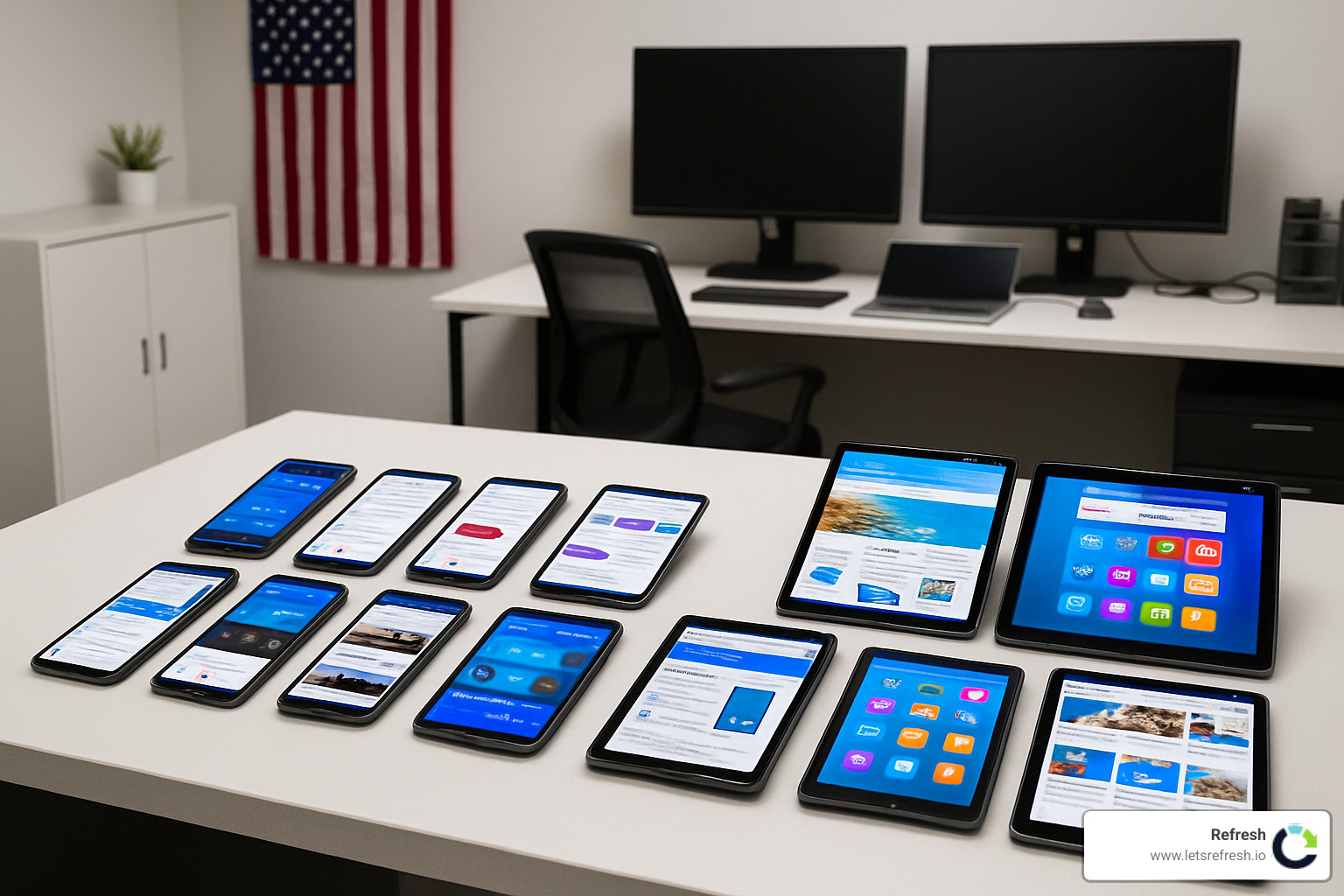
We recommend building a small device testing library with at least one iOS and one Android device. If budget allows, include tablets too. This hands-on testing reveals issues that emulators miss – like how your site responds to different touch gestures or how it behaves when switching between apps.
Beyond device testing, observe real people using your site. Informal user testing with friends, family, or colleagues can uncover surprising pain points. Watch where they hesitate, what they miss, and when they get frustrated. These observations are gold for improving your design.
When you're ready for more robust insights, consider setting up A/B tests to compare different approaches. Does that hamburger menu perform better than bottom navigation? Does your long-scroll homepage keep users engaged longer than a paginated approach? Let the data guide your decisions.
Analytics and Monitoring
Numbers tell stories that our eyes might miss. Set up mobile-specific analytics to track how smartphone and tablet users interact with your site differently from desktop visitors.
Pay special attention to Core Web Vitals – Google's metrics for measuring user experience. These include Largest Contentful Paint (loading performance), First Input Delay (interactivity), and Cumulative Layout Shift (visual stability). Poor scores here can hurt both user experience and search rankings.
Heat mapping tools like Hotjar or Crazy Egg show exactly where mobile users tap, scroll, and pause. This visual data often reveals surprising patterns – like users repeatedly tapping non-clickable elements or scrolling past important content.
One of our Pittsburgh clients finded through user recordings that mobile visitors were abandoning their checkout because the "Continue" button was positioned just below the keyboard on most phones. A simple layout adjustment increased mobile conversions by 23%.
Webflow mobile design audit routine
Make Webflow mobile design audits a regular habit – we recommend quarterly reviews at minimum. Here's our proven audit approach:
First, check your performance metrics using Lighthouse or PageSpeed Insights. These tools give you objective scores and specific recommendations for improvement. If your scores have dropped since your last audit, prioritize fixing those issues first.
Next, evaluate usability by systematically testing common user journeys on various devices. Can users easily complete key tasks like contacting you, finding information, or making purchases? Note any friction points.
Compare your mobile and desktop conversion rates. If mobile conversions lag significantly behind desktop, there's likely a mobile-specific issue to address. Similarly, check form completion rates – if mobile users start but don't finish forms, your forms may need optimization.
Review how mobile users steer through your site compared to desktop users. The Webflow UX Design principles we follow help ensure intuitive pathways for all users, but patterns change over time.
Finally, verify that your site meets current accessibility standards. Mobile accessibility has unique considerations – like ensuring touch targets are large enough for users with motor impairments.
Staying ahead of new devices
The mobile landscape evolves constantly. Remember when we thought 4-inch screens were large? Now we have foldable phones that transform from smartphone to tablet.
Future-proofing your Webflow mobile design means staying curious about emerging technologies. Foldable devices like the Samsung Galaxy Z Fold create new design challenges – how does your layout adapt when the screen suddenly doubles in size? Planning for these scenarios now saves headaches later.
Augmented reality (AR) is steadily entering the mainstream. Consider how your content might appear in AR contexts, where users might view your site layered over real-world environments. This shift will influence everything from color choices to layout priorities.
Voice interfaces continue growing in importance too. Is your content structured to be easily parsed and read aloud? Are your navigation paths logical when spoken? These considerations become increasingly important as voice search usage rises.
Dark mode support isn't just a trend – it's becoming an expectation. Many users switch to dark mode at night or keep it enabled permanently to reduce eye strain. Testing your color schemes in both light and dark contexts ensures your brand looks great either way.
At Refresh, we help our clients in Pittsburgh, Cleveland, and Charlotte stay ahead of these trends. We believe the best approach is flexible systems rather than rigid designs – creating layouts that can adapt to whatever new device arrives next.
Want to see how we've helped other businesses create beautiful, future-proof mobile experiences? Check out our Webflow Project Examples for inspiration.
Frequently Asked Questions about Webflow Mobile Design
Why should I prioritize Webflow mobile design when my traffic is mainly desktop?
I hear this question all the time from our clients in Pittsburgh and Cleveland, and I completely understand the hesitation. When your analytics show most visitors coming from desktop, focusing on mobile can feel like fixing something that isn't broken.
But here's the reality: even if desktop dominates your traffic today, the mobile landscape is shifting rapidly. Google now uses mobile-first indexing, which means your mobile experience directly impacts your SEO rankings for all users—desktop included.
More importantly, mobile and desktop users often have different intentions. We've found that mobile users frequently conduct initial research that later converts on desktop. One of our Pittsburgh clients finded this pattern in their B2B service company—after improving their mobile experience, their overall conversion rates jumped by 24%, even though most final conversions still happened on desktop.
Think of your mobile site as the first date and your desktop site as the relationship. If the first impression isn't good, you might never get to the second stage.
Is hiding desktop elements with display:none bad for SEO?
Yes, it absolutely can be, and this is one of those technical details that makes a huge difference. When you use display: none; to hide content on mobile, you're creating several problems:
First, your site still loads that hidden content, which slows down the mobile experience. Second, Google still indexes that content even though mobile users can't see it, creating a disconnect between what Google thinks your page offers and what mobile users actually experience. In worst-case scenarios, Google might even view this as cloaking—showing different content to search engines than to users—which can lead to penalties.
Instead of hiding elements, consider these more effective approaches:
- Restructure your content to work naturally across all devices
- Use progressive disclosure methods like accordions or tabs that keep content accessible
- Simplify content across all breakpoints (often this creates a better experience for everyone)
One of our Cleveland clients eliminated all instances of display: none; in their Webflow mobile design and saw their mobile page speed scores improve by 15 points almost immediately.
How often should I retest breakpoints as new phones launch?
This is a practical concern many of our clients share. With new devices launching constantly, it can feel like you need to be testing breakpoints every week!
In reality, we recommend a quarterly review of your Webflow mobile design breakpoints, with special attention after major device releases (typically September–October for iPhones and varying times for Android flagships).
The beauty of responsive design in Webflow is that if you've built your site properly with percentage-based layouts and flexible components, your design should adapt naturally to new screen sizes without requiring constant adjustments.
One of our Charlotte clients follows what I think is a wonderfully simple approach: they test their site on the newest iPhone and the newest Samsung Galaxy device each year, plus any device that shows unusual behavior in their analytics. This pragmatic strategy keeps them covered without creating endless testing cycles.
The goal isn't perfection on every possible device—it's creating an experience that works well across the spectrum of devices your actual customers use. Your analytics will tell you exactly which devices deserve the most attention.
Conclusion
Mobile design isn't just another checkbox on your website to-do list—it's becoming the primary way people experience your brand online. Throughout this guide, we've explored how Webflow mobile design creates experiences that meet users exactly where they are, with exactly what they need.
Remember when websites were designed exclusively for desktop screens? Those days are long gone. Today's users expect seamless experiences whether they're on their phone during a commute, checking your site on a tablet while relaxing on the couch, or sitting at their desk. By embracing the mobile-first approach we've outlined, you're not just accommodating mobile users—you're setting yourself up for success across all devices.
At Refresh, we've seen how thoughtful mobile design transforms businesses. One of our Pittsburgh clients saw their conversion rates jump by 32% after we reimagined their mobile experience—not because we added flashy features, but because we made it effortlessly simple for users to find information and take action.
The beauty of Webflow mobile design is that it combines powerful technical capabilities with intuitive visual editing. You don't need to be a coding expert to create responsive experiences that adapt beautifully to any screen size. What you do need is a clear strategy and an understanding of how mobile users actually interact with websites.
Mobile design is never "finished"—it's a continuous journey. New devices emerge, user expectations evolve, and best practices advance. The businesses that thrive are those that view their mobile presence as an ongoing investment rather than a one-time project. That's why we approach every client relationship as a true partnership focused on continuous optimization and future readiness.
Our team across Pittsburgh, Cleveland, and Charlotte specializes in creating Webflow sites that feel right at home on every device—from the latest iPhone to foldable Android devices and everything in between. We obsess over the details that make mobile experiences not just functional, but delightful.
Need a hand making your website shine on mobile? We'd love to help. Whether you need a complete mobile overhaul or just want to fine-tune your existing site, our team at Refresh is ready to guide you toward mobile experiences that truly connect with your audience and drive results.
Learn more about our Webflow development services or contact our team directly to discuss how we can help with your specific Webflow mobile design needs.


.avif)